


DICK’S Sporting Goods
Driving improvements across a $1B+ eCommerce experience through a scalable homepage system and continuous optimization.
The Challenge
DICK’S Sporting Goods and its subsidiaries operated high-traffic eCommerce homepages responsible for driving engagement and revenue at massive scale. These pages carried significant business importance but were designed as fragmented, promotion-heavy layouts that competed for attention and limited performance.
The challenge was to evolve these homepages into cohesive, scalable experiences that could better serve customers, support business priorities, and continuously improve performance over time.
The Outcome
A redesigned homepage template system that simplified the user experience while increasing flexibility for merchandising and storytelling. Through ongoing iteration, testing, and cross-functional collaboration, these improvements contributed to over $1B in annual eCommerce sales, improved engagement, and greater production efficiency across brands.
My Role
As UI Design Manager, I led the team responsible for designing and producing homepage experiences across DICK’S Sporting Goods, Field & Stream, and other subsidiaries. My role included managing designers and fostering close partnerships with UX, development, analytics, and business teams to drive an iterative improvement strategy focused on engagement and revenue growth.
In parallel, I served as the Design Sponsor for an organization-wide digital ADA compliance initiative, working closely with other discipline-specific sponsors to ensure WCAG 2.0 AA compliance across all online properties. This required significant collaboration, design system updates, and validation efforts to balance accessibility, performance, and speed at enterprise scale.
Designing for Scale and Performance
With multiple brands and frequent content changes, the homepage needed to work as both a customer-facing experience and a highly efficient production system.
We shifted away from one-off designs toward a modular, reusable template approach that allowed teams to quickly assemble pages while maintaining visual consistency and clear hierarchy. This approach reduced noise, improved scannability, and made it easier for customers to understand what mattered most.
DICK’S Sporting Goods Homepage
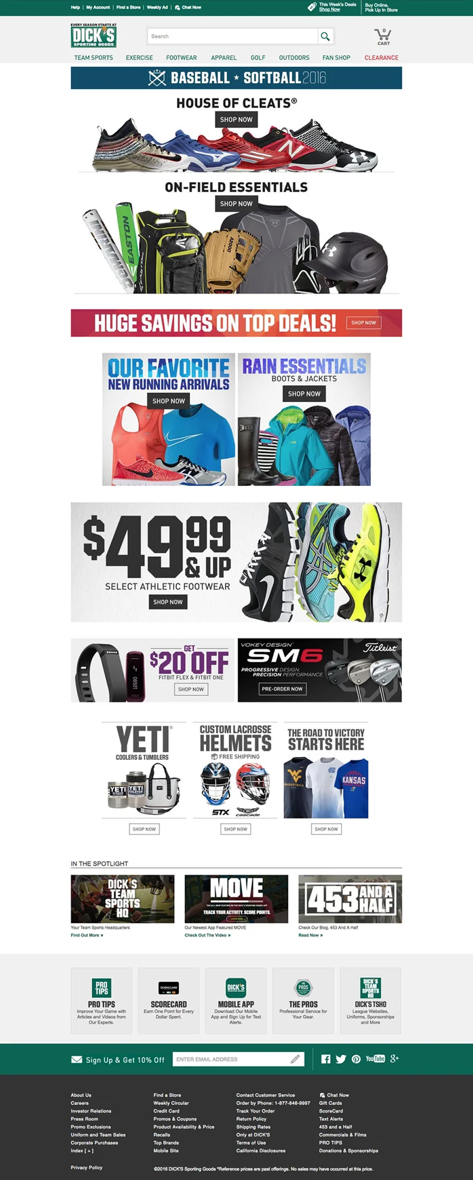
Historically, the DICK’S homepage treated each category or promotion as its own visual moment. While eye-catching, this approach created fragmentation and cognitive overload.
The redesigned experience took a more holistic approach. Clear structure, consistent spacing, and simplified visual treatments helped distinguish categories and guide users more naturally through the page. The UI team worked closely with UX and analytics partners, running ongoing tests to understand which patterns improved engagement while still supporting business priorities.
BEFORE
AFTER
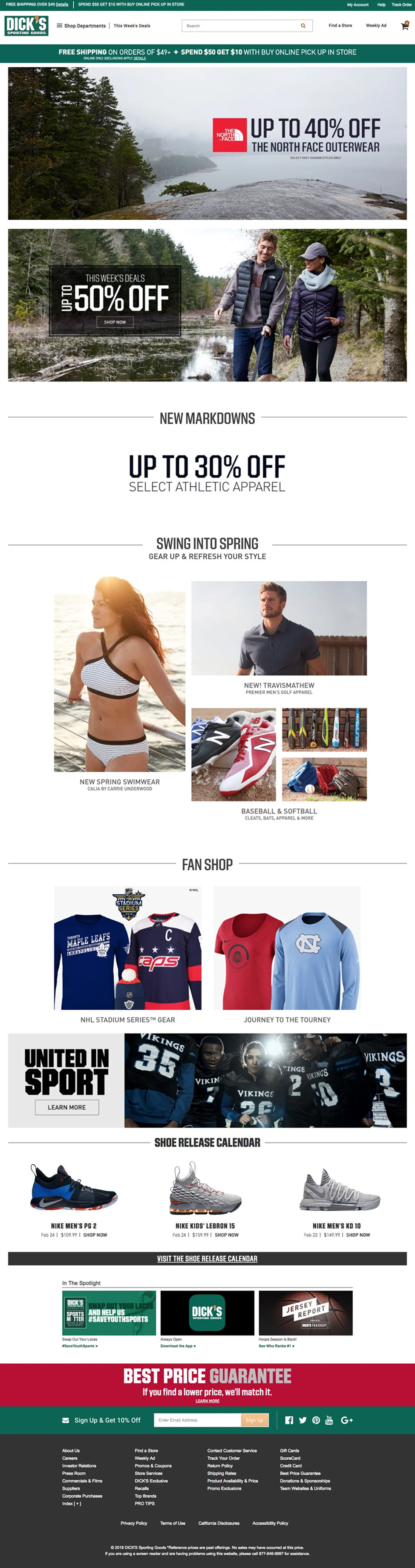

A fragmented homepage experience where individual promotions competed for attention, creating visual noise and cognitive load.
A simplified, modular homepage system that improved clarity, hierarchy, and customer navigation while supporting business goals.
Field & Stream Homepage
Field & Stream presented an opportunity to apply the same principles while testing new approaches tailored to a different audience and seasonal content mix.
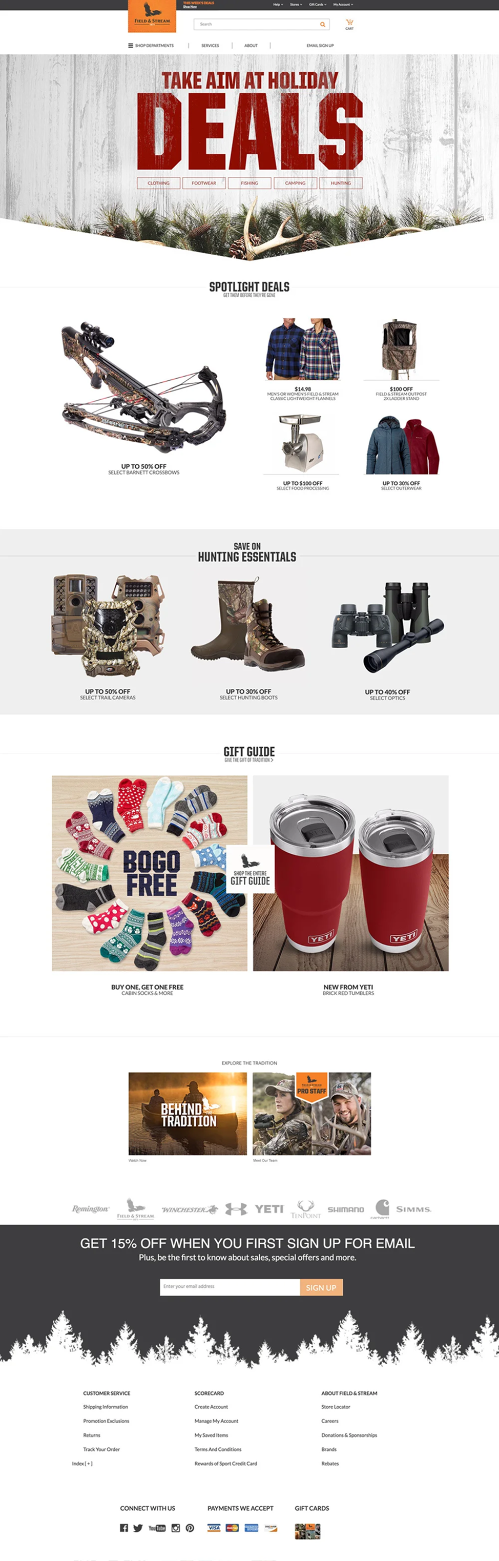
As with DICK’S, the homepage had previously been designed as a series of standalone banners competing for attention. We reworked the experience to connect stories and products more cohesively, creating a clearer narrative flow across the page.
Through testing and close collaboration with analytics and business partners, these changes helped drive improved performance. The holiday homepage comparison below highlights the evolution from 2016 to 2017.
BEFORE
AFTER
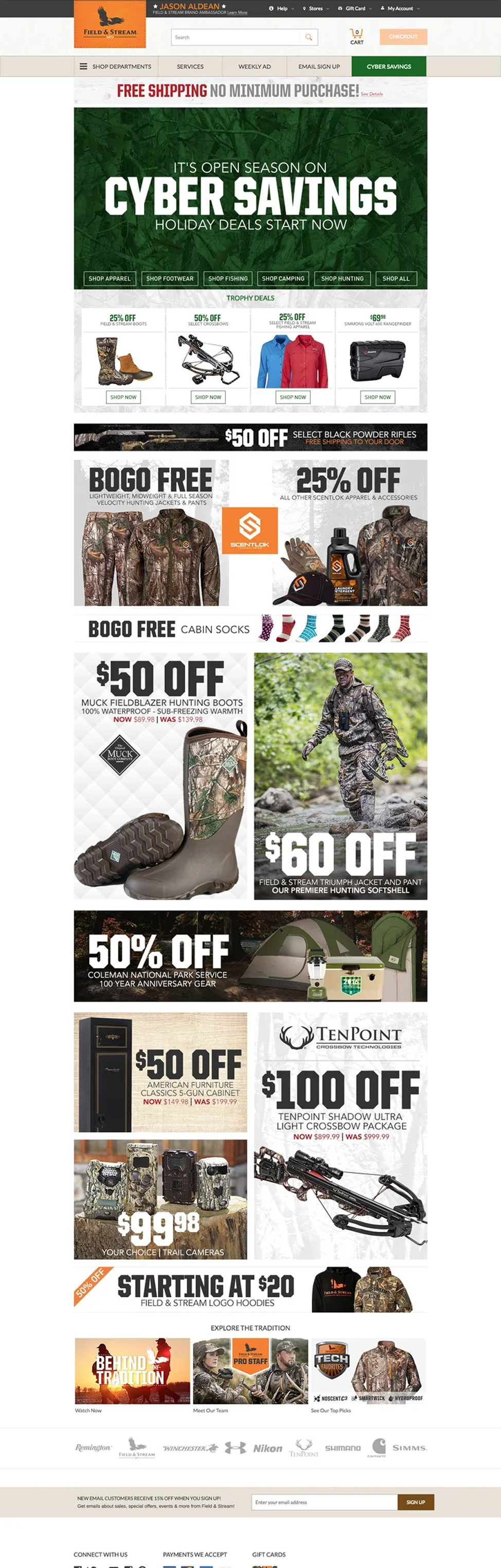
A promotional-heavy layout where each section functioned as a standalone banner competing for attention.
A more cohesive, story-driven homepage that balanced merchandising and content while improving usability and performance.
Iterating Through Partnership and Data
Rather than treating the homepage as a static deliverable, we approached it as a living product. The UI team worked closely with UX, analytics, and development partners to ensure designs could be implemented efficiently and tested quickly without disrupting ongoing business operations.
This iterative approach allowed us to:
Validate design decisions with real customer data
Adapt quickly to changing business priorities
Improve performance incrementally without large re-platforming efforts
Over time, these improvements compounded into meaningful gains, including eCommerce experiences that surpassed $1 billion in annual revenue for the first time, faster design delivery through reusable templates, and reduced development time enabled by a more modular, scalable homepage system.
The Impact
1. Improved user experience and clarity
Simplified layouts and consistent patterns reduced cognitive load and helped customers navigate more confidently.
2. Increased engagement and revenue
Ongoing iteration and optimization contributed to over $1B in annual eCommerce sales.
3. Greater production efficiency
Reusable templates and standardized components reduced design and production overhead.
4. Stronger cross-functional collaboration
Close partnerships with UX, analytics, and business teams created shared ownership of performance outcomes.
5. A scalable foundation for growth
The homepage system supported multiple brands, seasonal shifts, and evolving business needs.
How I Led The Work
Design leadership at scale
Led a UI team responsible for high-traffic, revenue-critical eCommerce experiences across multiple brands.
Systems thinking
Established a modular homepage framework that balanced customer experience and business flexibility.
Data-informed decision-making
Partnered with analytics and UX teams to guide iterative improvements.
Cross-functional influence
Aligned design, business, and technology partners around shared performance goals.
Operational excellence
Improved efficiency through reusable templates and standardized patterns.
Accessibility leadership
Served as Design Sponsor for an enterprise-wide digital accessibility initiative, ensuring WCAG 2.0 AA compliance across multiple brands and platforms.
Conclusion
This work transformed the homepage from a collection of competing promotions into a cohesive, scalable eCommerce experience. By simplifying design, embracing iteration, and grounding decisions in data, the team helped DICK’S Sporting Goods and Field & Stream improve usability, efficiency, and revenue at scale.
The result was not just better-looking pages, but a more effective and resilient foundation for ongoing eCommerce growth.