

eCommerce Homepage Design
The Challenge
Lead the UI team charged with improving engagement and revenue generated by the DICK’S Sporting Goods and its subsidiaries’ homepages.
The Outcome
A template system that improved user experience, production efficiency, engagement, and revenue.
My Role
As the UI Design Manager, my responsibilities included leading the team of designers who worked on the homepages each week, fostering relationships with UX, analytics, and business partners, and driving the iterative improvement strategy to grow online sales. The efforts on homepages also coincided with other work the team took on to redesign headers and footers, become ADA-compliant, and other homepage-specific tasks.

DICK’S Sporting Goods (DSG) has a number of eCommerce web properties that the UI team was responsible for designing and producing. Due to the volume of products and stories required to appear on their homepages, the UI team had to find ways to balance the best user experience with the needs of the business. Through establishing more streamlined templates and a cleaner UI, the homepage became a place where customers could be served the most important business messages in a meaningful way. Over the course of 18 months, each homepage continued to iterate and improve performance. These improvements helped drive eCommerce performance past $1 billion in sales per year.
DICK’S Sporting Goods Homepage
For DSG, the homepage had historically been set up to mimic an experience more akin to a newspaper tab. Each product or category often had its own design style in order to draw attention to it. The result was a somewhat confusing experience for the customer. While the performance of the homepage BEFORE was deemed adequate, there was certainly room for improvement. As you can see in the AFTER homepage image below, a holistic approach was taken. By simplifying the design of the page and allowing for a more clear delineation between products and categories, user experience improved.
The UI Design team worked closely with our UX partners throughout the endeavor, as well as our analytics teams, running countless tests to understand what design elements were meaningful for customers while taking into account business needs.
Before

After

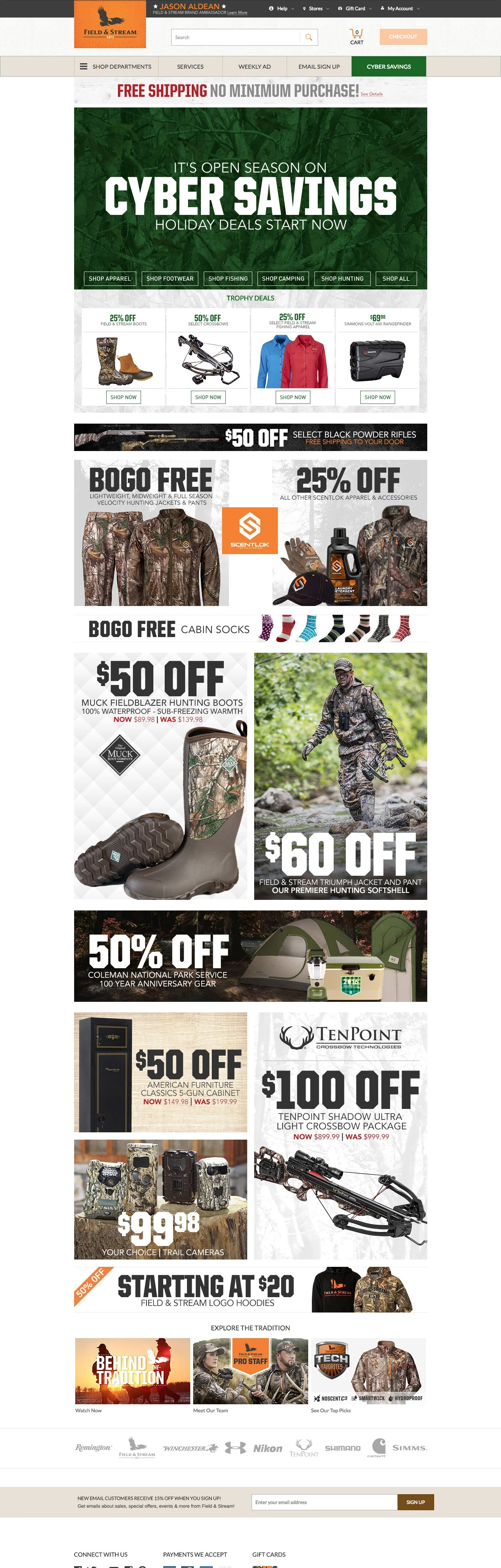
Field & Stream Homepage
Field & Stream, a subsidiary of DSG, was another site that presented our team with several opportunities to test new ways of approaching the homepage. Like DSG, the homepage was treated like a newspaper tab as late as 2016. So, we worked to create a more holistic experience that tied the different stories and products together, rather than treating each spot like its own banner ad competing for space. Again, through testing and close partnerships with different teams in the organization, we were able to help drive improved performance—the before-and-after below showcases holiday homepages between 2016 and 2017.
Before
After
